Trois mille for De Roma Festival
Antwerp's historic cultural venue updates its visual system.
Antwerp's historic cultural venue updates its visual system.
De Roma is s hub known for its carefully curated programme of live music, originally revived in 2003 through the initiative of a small group of cultural organizers and hundreds of volunteers, the venue continues to operate through this strong collective spirit.
In 2024, designer Rob Marcelis developed a complete redesign of De Roma’s logo and visual identity, updating the system to better reflect the venue’s contemporary programming and its increasingly digital communication channels.


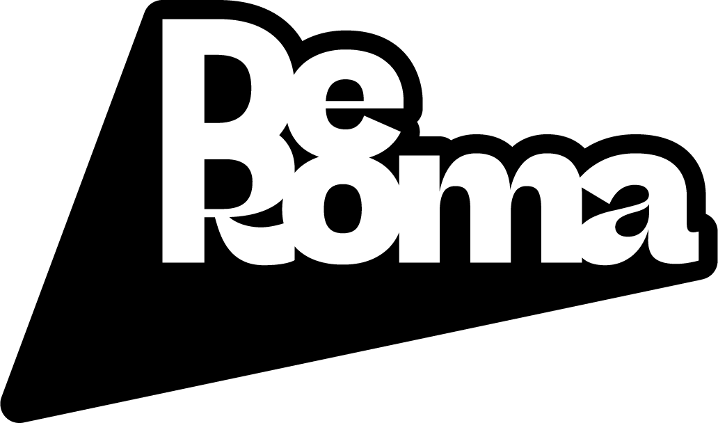
The venue’s logo itself is based on a modified version of Beatrice Deck, the high-contrast flagship style of the Beatrice superfamily designed by Lucas Sharp with Connor Davenport and released through Sharp Type.
The wider visual identity relies on Trois Mille. First introduced in 2016 as Marc Rouault’s TypeMedia thesis project and later distributed through Sharp Type. Trois Mille draws inspiration from typographic master Roger Excoffon, the typeface combines dynamic forms with an expansive construction.


In De Roma’s communications — from posters to event announcements — Trois Mille provides a distinctive, energetic voice that balances expressiveness with clarity, demonstrating how a singular display typeface can anchor an entire cultural identity.
Featured Fonts
Featured Fonts